Field Note
Architecture diagrams do not show the operating model
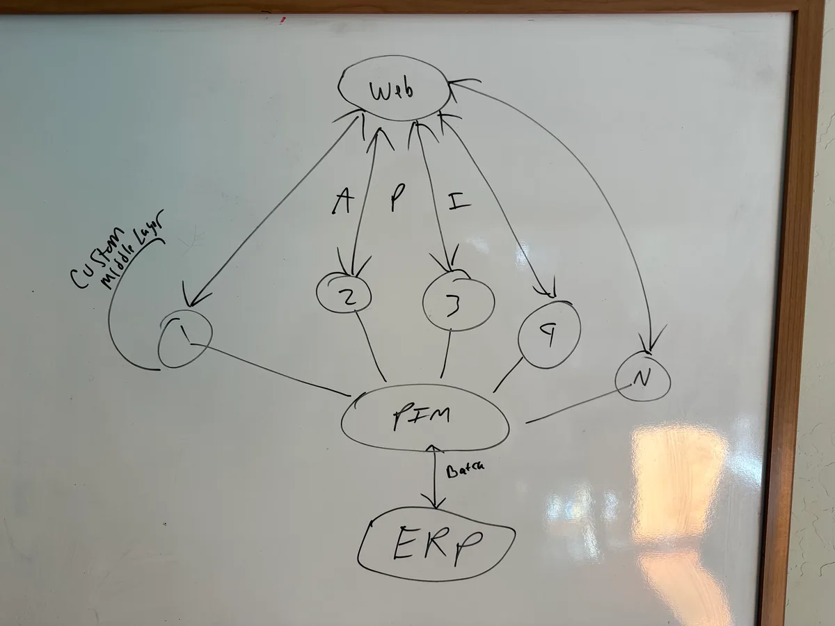
I like a good architecture diagram. I also know how much trouble can hide behind a clean arrow.
The boxes show applications. The arrows show integrations. Everything can be technically accurate and still leave out most of the reasons the system is painful to change.
Who owns the decision? How long does a release take? Which vendor has to be called? Where has the team learned to work around the design because fixing it became harder than living with it?
Those omissions matter when the question is whether to invest, modernize, replace, or leave the system alone.
Add the people to the picture
I do not mean drawing org-chart boxes around the applications. I mean asking how work moves through the system.
Who can approve a change? Which team understands the integration? Who gets called when an order is stuck? Which capability belongs to a vendor whose contract is about to change? Where is the only person who knows why a nightly job exists?
The answer often explains more about delivery risk than the choice of technology.
Trace one ordinary change
One test I use is to pick a change the business considers normal and follow it end to end.
For example: add a product attribute, change a promotion, enter a new market, introduce a payment method, or alter an order status.
Then record:
- Which systems change.
- Which teams participate.
- Which approvals are required.
- How the change is tested.
- How long each wait state lasts.
- What happens if the release fails.
The architecture diagram may show a clean path. The change history usually shows the real one.
Look for concentrated knowledge
Legacy risk is often described as old technology. Age is only part of it.
A current platform can be high risk when its behavior is understood by one person, its deployment path is mostly manual, or its integrations depend on assumptions nobody has written down. An older platform can be reasonably safe when ownership is clear, changes are tested, and the operating knowledge is distributed.
This is why replacing the box does not automatically remove the risk. A company can migrate the same ownership gaps, unclear decisions, and fragile processes into newer software.
Put economics beside architecture
The same diagram means different things depending on cost and business importance.
I want the operating cost, vendor commitments, failure history, change demand, and material business constraints beside the technical view. A highly coupled system supporting a stable capability may not deserve immediate intervention. A seemingly modern service that blocks a critical business change may.
Priority comes from the consequence, not the visual untidiness of the diagram.
The deliverable is a decision
An assessment should not end with a larger inventory of problems. It should make the next decision easier.
That may mean replacing a platform. It may mean stabilizing an integration, changing team ownership, documenting a recovery path, or sequencing work so the company can preserve options.
A diagram describes the technology. A useful assessment tells me whether the organization can operate it and what has to change if it cannot.
The boxes were the easy part.